NSandI.com
NS&I is unique. 169 years old, government-backed, savings bank. They manage 207 billion pounds for 25 million savers, one in three people in the UK.
The organisation is going through a large digital transformation which I have been part of so far.
See an overview of projects completed and some which are still underway.
A key project was to launch an MVP of the consumer website to improve the experience and signal the changes coming.
Role & Approach
My first task was to recruit and assemble a great team of designers, UXers, content creators, and tech engineers.
We then invited NS&I’s internal brand, marketing, research, and development teams to work in direct collaboration. This formed one solid unit with a single vision, to create a great product for customers.
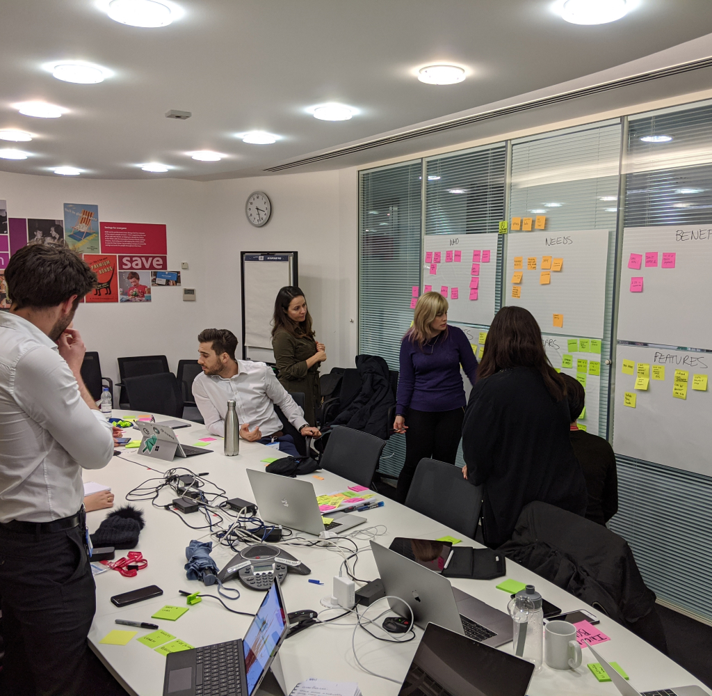
1.0 Requirements gathering
We had ample data on users, market analysis, and CSAT data about the shortcomings of the existing website.
Customer satisfaction was low mainly because of a lack of relevant content, complex site navigations, poor help content, and lack of search functionality.
The existing website looked dated, and customers did not emotionally connect with the brand.
Business insight
Existing customers found it hard to find key information and the story, brand look and feel and functionality did not fill new customers with confidence.
Customer insight
Customers found the navigation complex, the content, and the help content were not very useful, and product propositions were not clearly articulated.
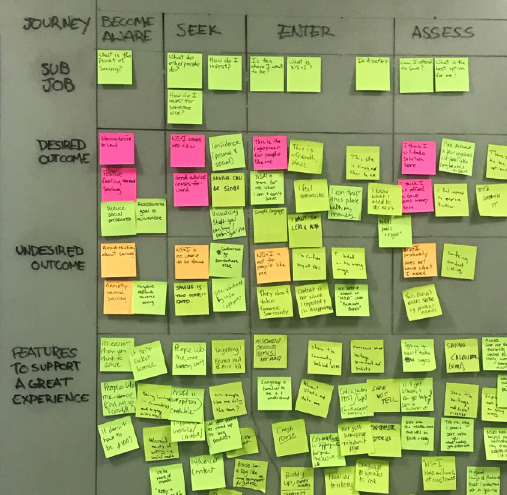
Experience vision
The goal was to create a site based on tested user journeys, content, and architecture.
Apply the fresh brand to appeal to a younger audience and signal the beginning of the transformation of the bank.
2.0 Definition & vision
This was a great project to use as a testing ground, not just for the brand strategy and look and feel, but also for setting future UX and experience principles.
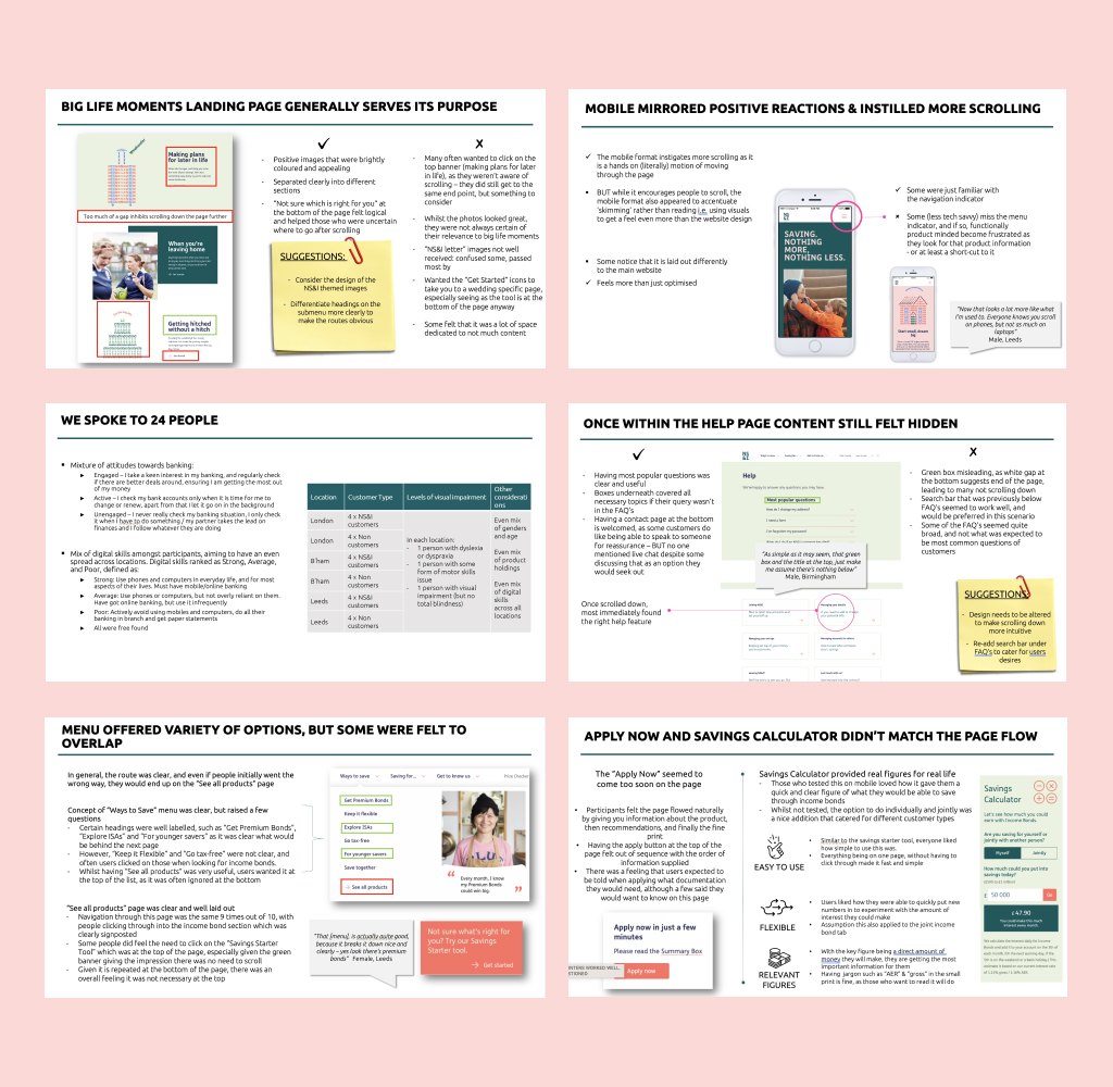
We went through a series of Low-fidelity prototypes to put in front of users, test, and get quick feedback.
We tested the navigation, IA, and user journeys. using Treejack, surveys, and focus groups to get both qualitative and quantitative feedback.
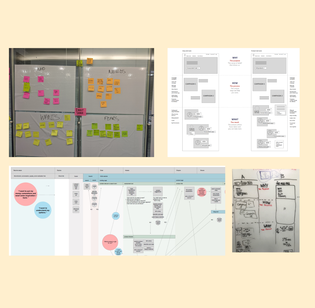
3.0 Prototyping and testing
We took our learnings from the Low-fidelity testing and created a High-fidelity prototype to be tested for updated architecture, content, information hierarchy, and brand look and feel.
We went through a number of iterations and through continuous learning and optimising, we got to a place where we were happy to launch the Beta.
The site is never finished. We always have an eye on analytics to identify and define new problems, design, test, and learn.
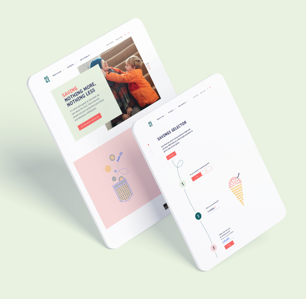
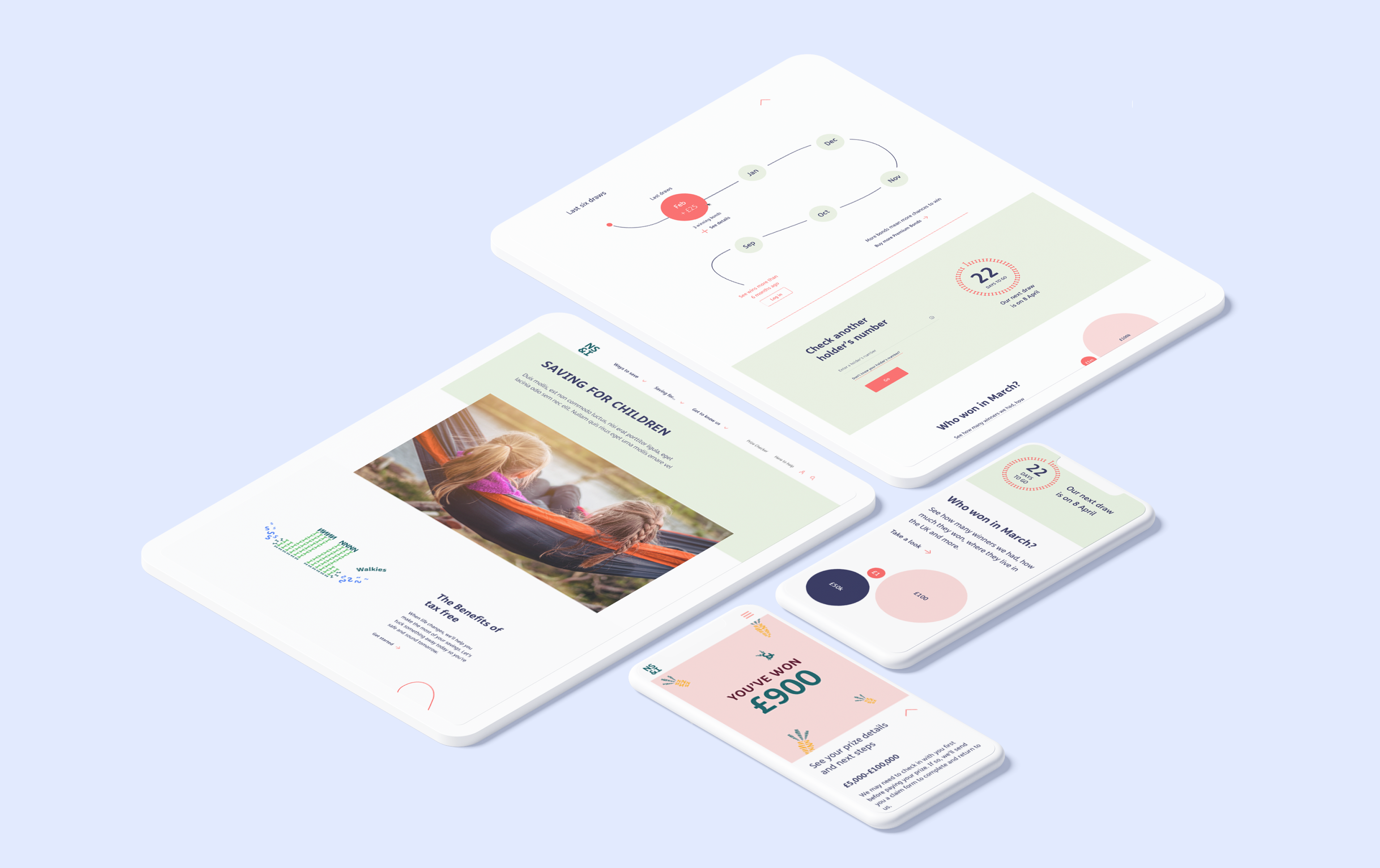
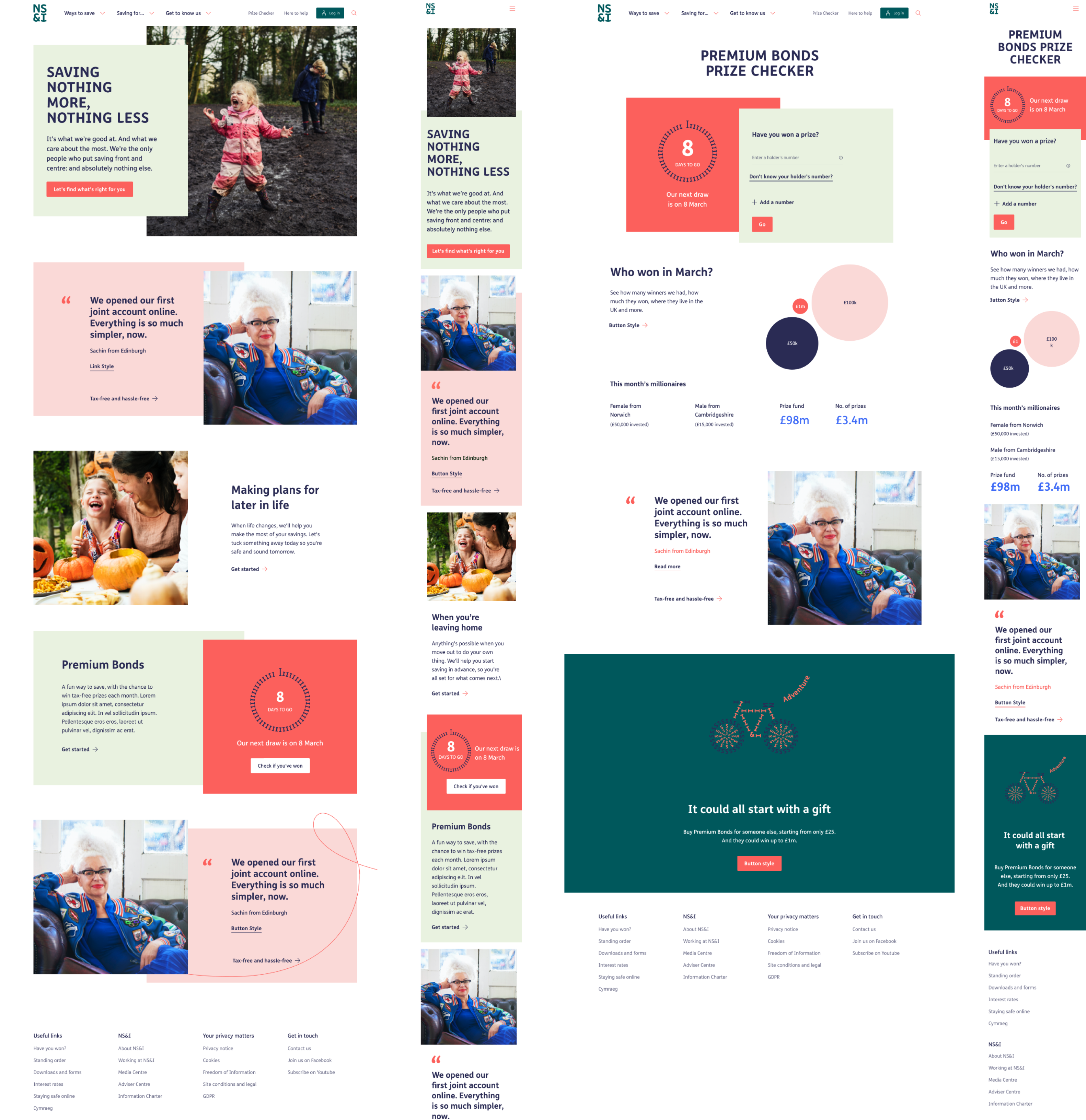
4.0 Design execution
The outcome is a beautifully designed responsive nsandi.com. A site that makes the organisation stand out amongst the majority of, very corporate-looking, competitors without losing credibility and trust.
Thoroughly validated user journeys, architecture, and information hierarchy provide answers, tools, and content to some of the most searched savings terms online; as well as providing savers with a reassuring and intuitive home for their hard-earned money.
The fresh brand look and feel is a welcome change to younger customers without alienating the existing customer base.
Results
one year on, we reviewed and tested the site to compare the effectiveness of the site compared to previous years. Overall users loved the new look and feel of the new website and the way the brand personality comes across. Below are some key finding.
86%
Positive customer feedback compared to 43% on the previous site.
+92%
Increase in positive feedback on the Premium Bonds Prize Checking journey.
-35%
Decrease in loading time across the site.
-63%
Decrease in time discovering relevant content due to improved site architecture.