Rafael
Valls
Rafael Valls is a St. James’s art gallery in the West End of London dealing mainly in Master Paintings from the 16th to the 19th Centuries.
Owned and run by Rafael Valls and his wife Caroline, the gallery has traded for over forty years, and it carries an eclectic and varied stock with an enviable reputation for trompe l’oeil and slightly unusual paintings.
They specialise in Dutch, Flemish, and Spanish paintings but with a wide interest in all other nationalities as well.
Background
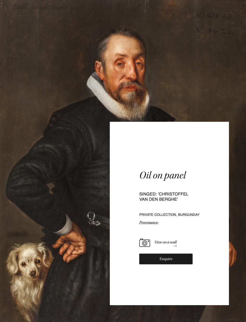
The gallery carries an eclectic and varied collection with an enviable reputation for trompe l’oeil and slightly unusual paintings. They specialise in Dutch, Flemish, and Spanish paintings but with a wide interest in all other nationalities as well.
The quality of their painting wasn’t coming through their old website and the brand was non-existent. The gallery needed a simple brand and an online presence worthy of the beautiful paintings they have on offer.
Approach
This project was running on tight deadlines to launch the site on time for a number of art fairs and exhibitions.
We had to take a pragmatic approach to requirement gathering to identify the business and user needs.
1.0-Requirments gathering, definition & vision
To get us going quickly, I first started by visiting the gallery to explore the space and view the collection of paintings.
I then ran a workshop with the client to get under the skin of the business to understand the challenges and the user needs.
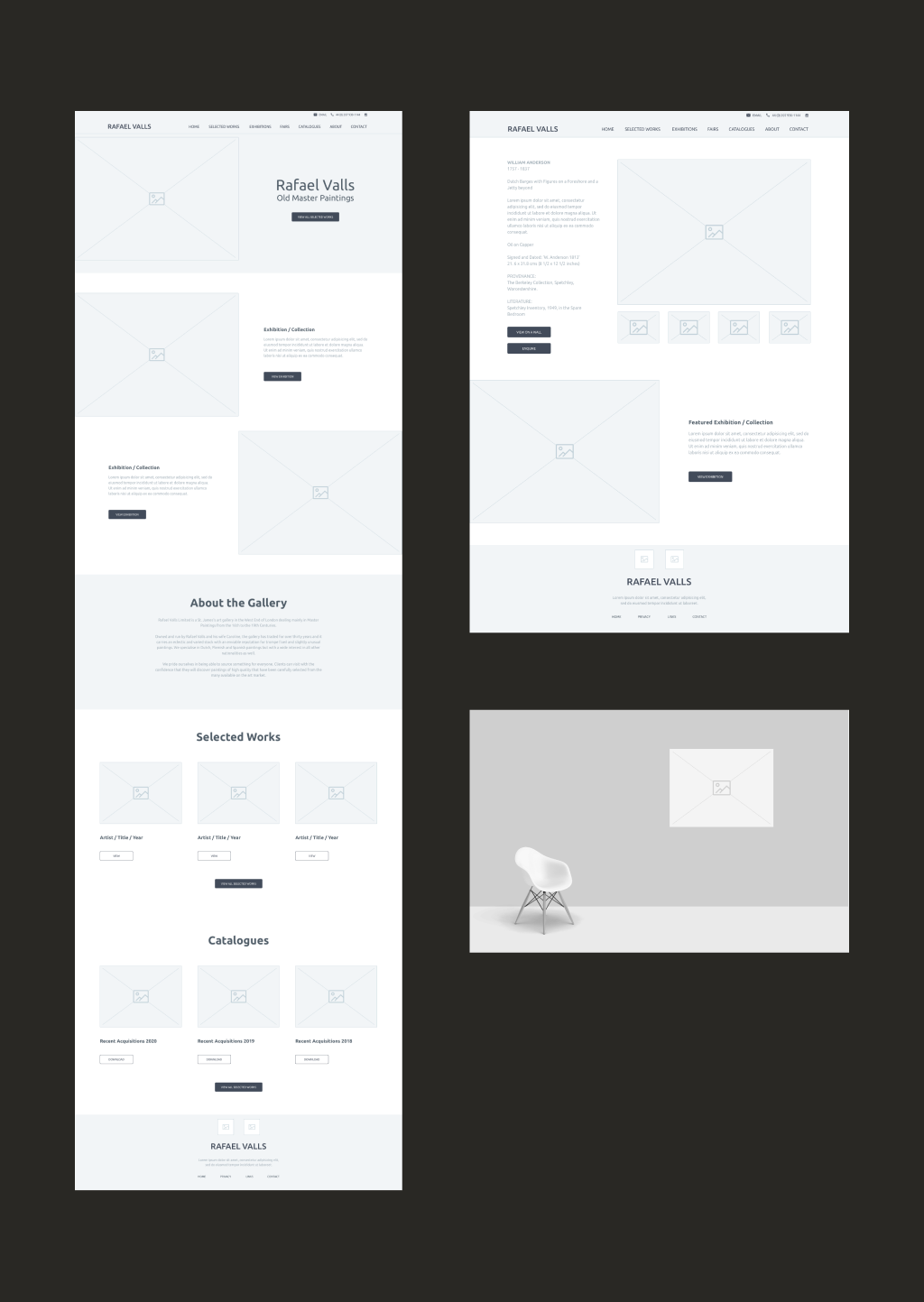
It quickly became apparent that the gallery was lacking a clear brand and positioning. Their existing site had limited capabilities to allow the editors to create pages and showcase their paintings in a consistent way.
Working collaboratively with the stakeholders, in a workshop, we managed to establish a vision for the future of the site which was based on simplicity, premium and, quality.
2.0-Design execution
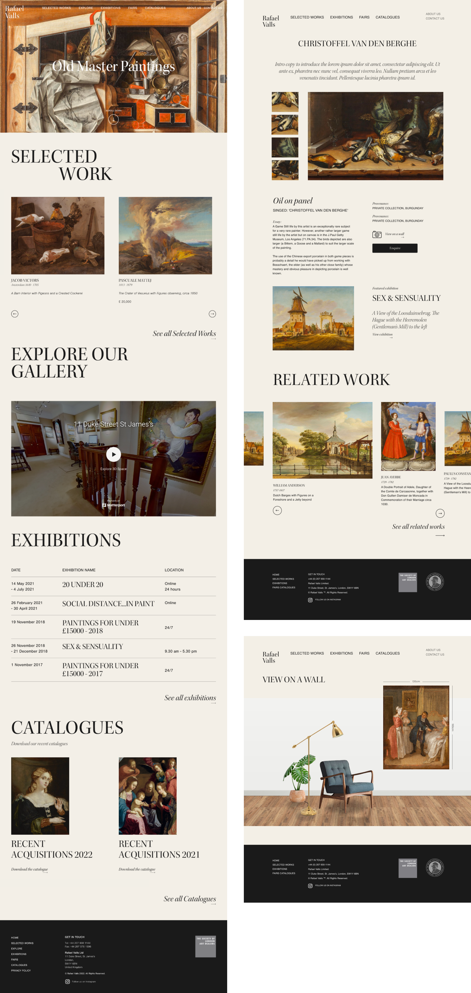
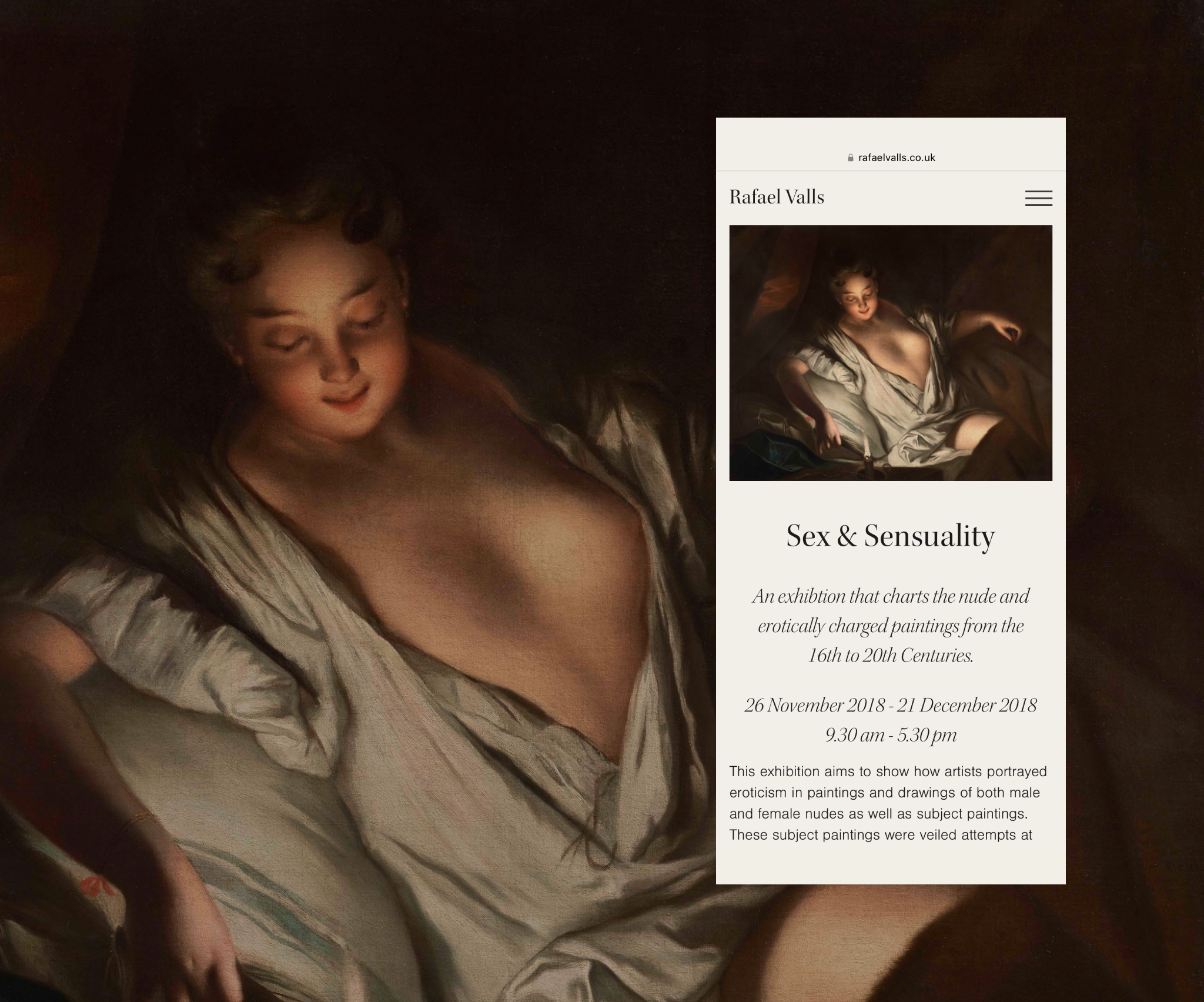
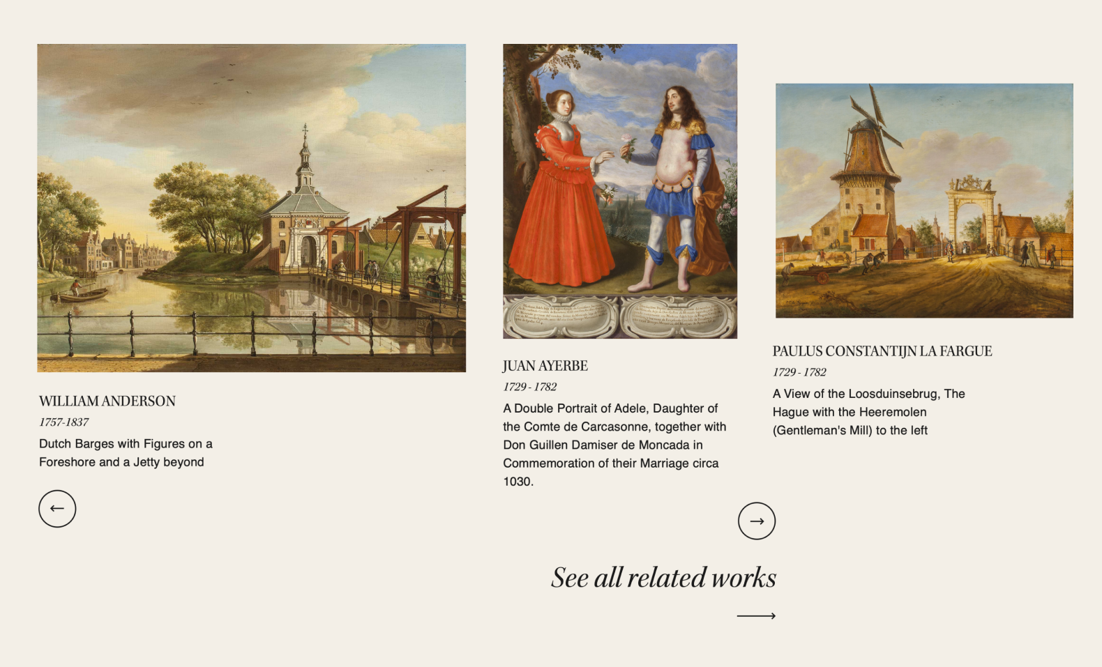
Projects like this don't come around very often and as a designer, it was a dream to work with so many beautiful visual assets. The challenge was to create designs that were as simple as possible to not get in the way and hero the paintings.
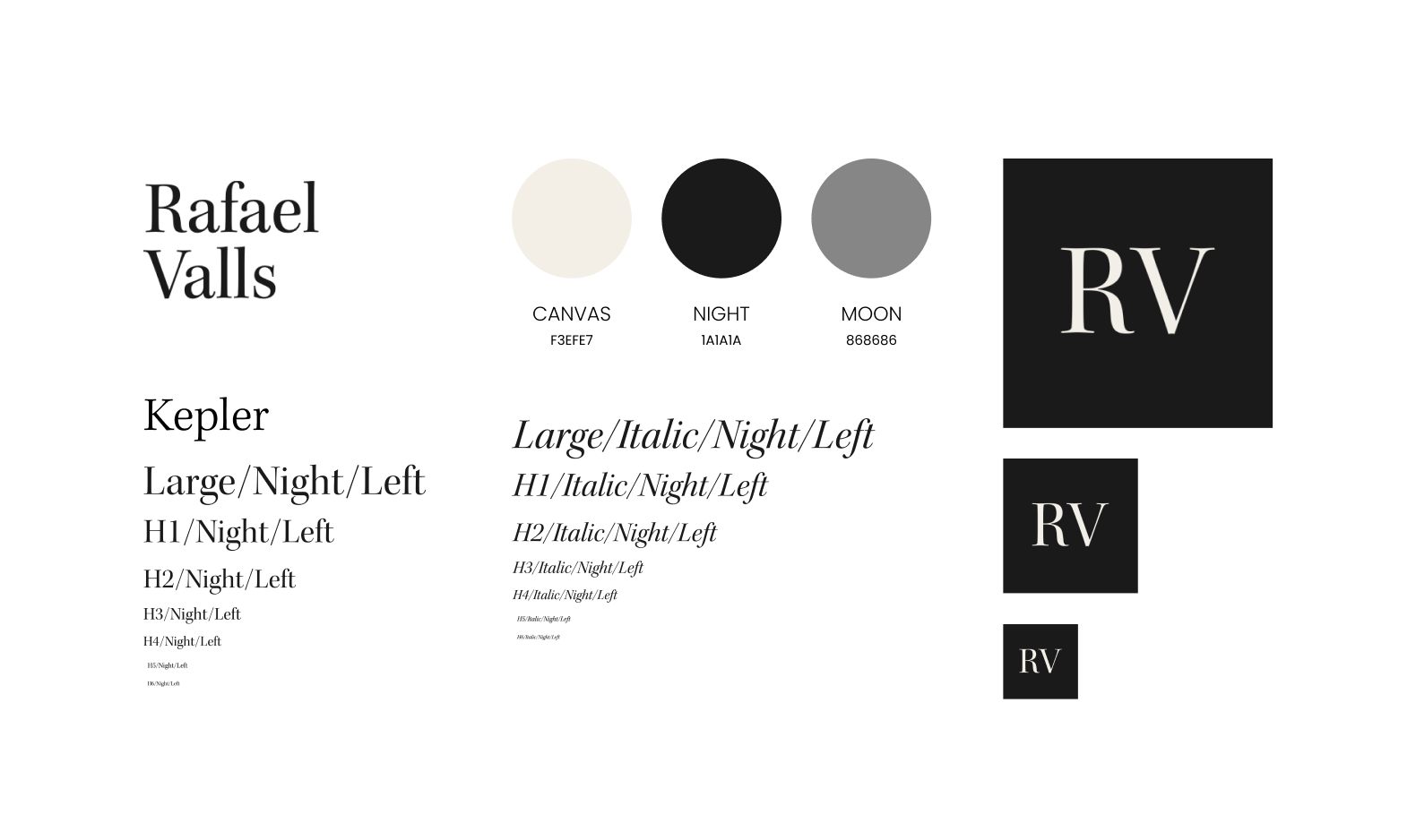
The first step in the design process was to create a simple brand and positioning to give the gallery the credibility it deserves.
For the typography, I used Kepler as the primary font. The font is based on Renaissance period type characteristics. It is simple, clean, and optimised for digital applications.
I then established a simple colour palette derived from colours used in paintings in their collection.
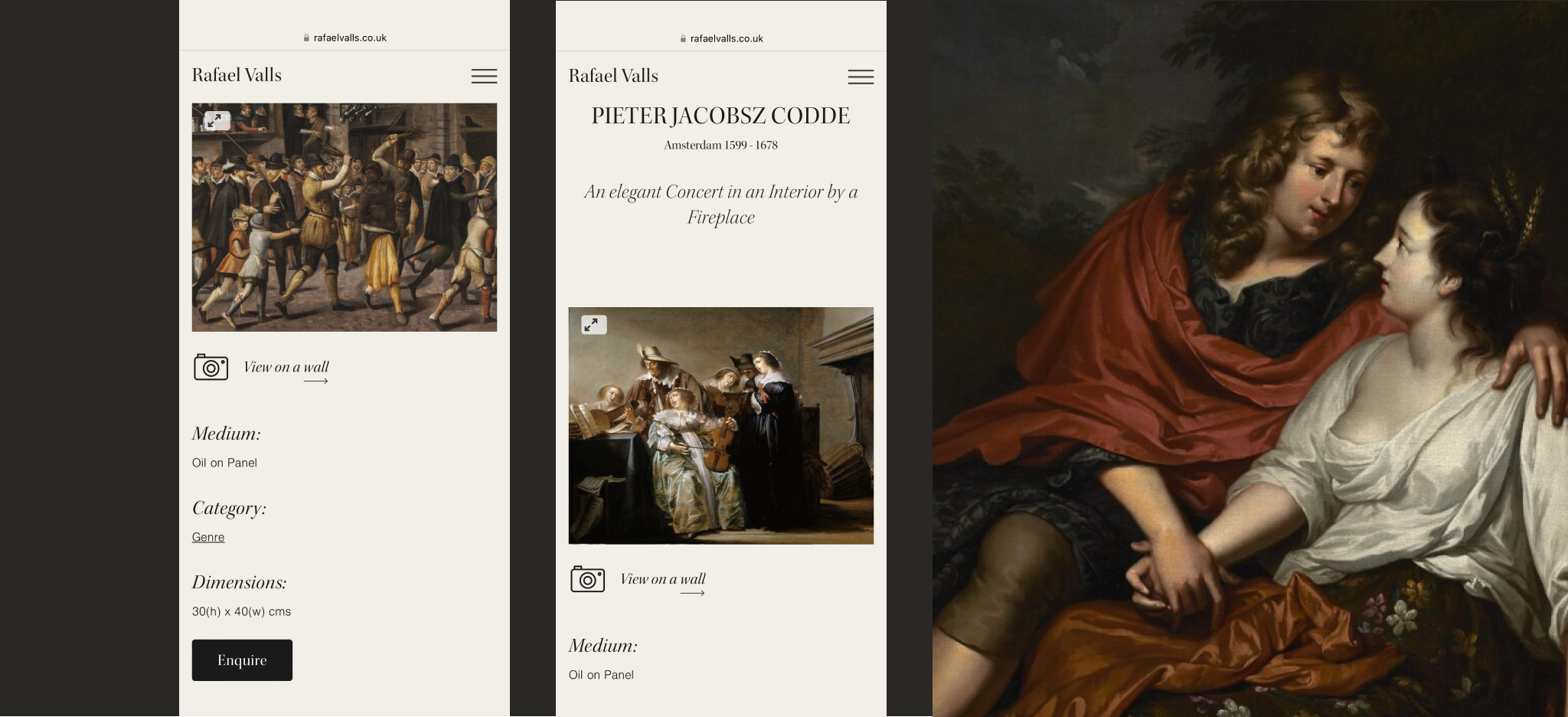
A clear navigation, site architecture, and information hierarchy ensured a consistent experience throughout the site. this also enabled editors to create pages and collections easily.
We also created a feature for the user to view the painting on a wall in their environment to give them a sense of scale and dimensions.